
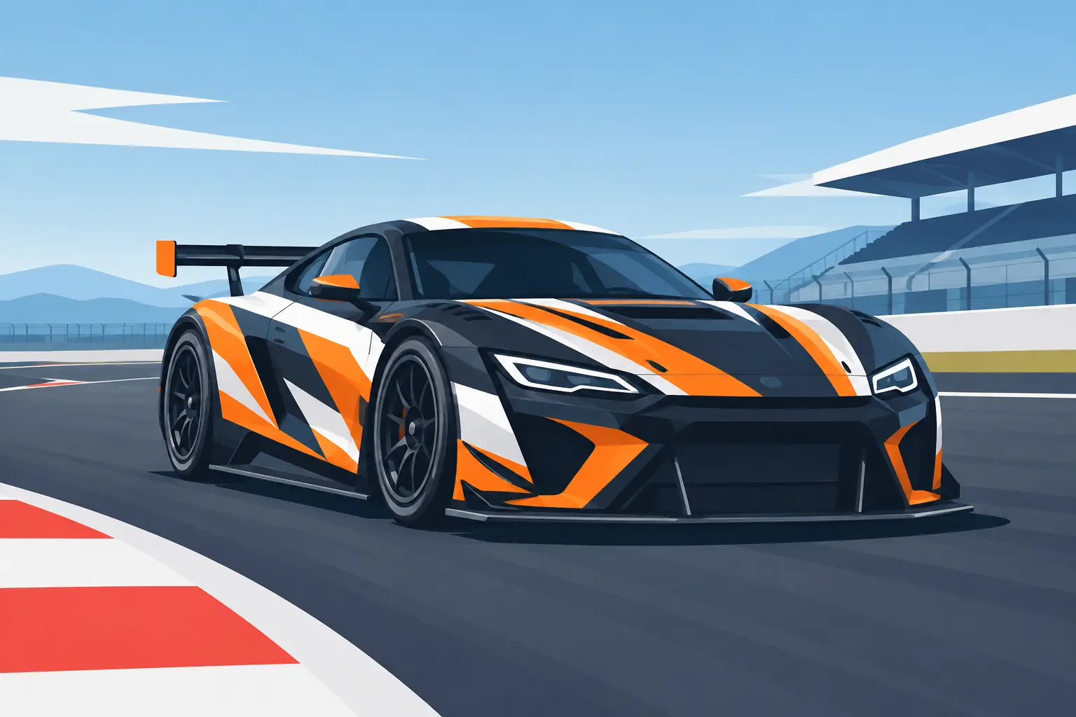
A race car has only a few seconds to make an impression in the staging lanes, on the grid, or in a photo from the grandstands. Your graphics need to do more than look fast. They need to identify the driver, make the number readable, give sponsors useful exposure, and survive heat, debris, fuel splatter, washing, and trailer miles. This race car graphics guide shows how to build a layout that works under real track conditions.
Start With the Rules, Not the Artwork
The best-looking number kit is no help if it fails tech inspection or cannot be scored from the tower. Before choosing a font or color, check the current requirements from your sanctioning body, track, or series. Rules can define number size, placement, color contrast, class decals, contingency decals, windshield banner limits, and even which areas must remain clear.
Most series expect numbers to appear on both sides of the car and often on the roof, hood, rear, or windshield. Exact placement depends on the class and vehicle. Circle track, drag racing, road racing, dirt racing, karting, and off-road competition all handle identification differently.
Build the required pieces into the design first. Numbers, class designations, driver name, and mandatory decals are the non-negotiable layer. Once those are placed, you can use the remaining body panels for team identity, sponsor logos, accent stripes, and personal style.
Make the Race Number Impossible to Miss
A race number is functional equipment. It should be readable from the flag stand, the pits, timing positions, and a distance away on track. Fancy typography may look great on a computer screen but become a blur when the car is moving or covered in dust.
Choose a bold font with open shapes and consistent stroke weight. Avoid thin scripts, tight shadows, excessive outlines, and numbers that overlap so heavily they read as one shape. A simple block or italicized racing style usually gives the best balance of personality and legibility.
Contrast matters as much as the font. White numbers on a dark body color, black numbers on a light body color, or bright yellow numbers on a dark blue or black panel are proven combinations. If the body already uses a busy wrap, stripe package, or camo pattern, add a solid number panel behind the digits. An outline can help, but it should support contrast rather than replace it.
Keep this test in mind: take a photo of the car from across the lot, then shrink the image on your phone. If you cannot read the number instantly, simplify the design.
Use a hierarchy that reads at speed
Your graphics should have a clear order. The race number comes first. The primary team or business name comes next. Sponsors and supporting details follow after that. When every element is oversized, nothing stands out.
A strong layout often uses the door or side panel as the main number zone, with the driver name along the roof rail or window and sponsor information organized around the available space. On a drag car, the rear quarter, door, hood, and windshield may each serve a different purpose. On a dirt car with large side panels, use that area for a number package that stays readable through mud and dust.
Choose Colors for Visibility and Identity
Race graphics should match your car, trailer, team shirts, and business branding when possible. Consistent colors make a small operation look organized and help fans recognize the car from event to event. Still, a clean color plan beats a crowded one.
Start with one dominant body color, one high-contrast number color, and one or two accent colors. This keeps the car visible without turning every panel into a competing design. Metallic, chrome, fluorescent, and reflective vinyl can add impact, but use them strategically. Chrome can disappear in bright sun, while fluorescent colors may be highly visible but may not match every sponsor logo or paint color.
Consider the track environment, too. White graphics can get lost against a pale concrete wall in photos. Dark graphics can vanish during night racing if they lack a light outline. Dirt-track cars need combinations that remain visible when the lower body is dirty. The right choice depends on where and when you race.
Plan Sponsor Graphics Like a Pro
Sponsors deserve more than a logo squeezed into leftover space. If a business supports your program, give its name an area that can be seen in photos and from the stands. The size and position should reflect the sponsor level, but every logo should remain legible.
Keep logos in their original proportions. Stretching a logo to fill a panel makes it look unprofessional and can create problems for sponsors with brand standards. If a logo is too detailed for the available space, use a simplified wordmark or reserve a larger panel for it.
The most effective sponsor layouts usually assign premium space to one primary sponsor, then group smaller sponsors along the rocker panel, rear quarter, fender, deck lid, or other secondary area. Avoid placing essential logos over door seams, fuel doors, vents, rivets, or heavily curved sections whenever possible. Those obstacles can break up the design and reduce durability.
If you run your own company, treat the car as a mobile sign. Include the business name and a clear service description before adding a phone number or social handle. At track speed, a short message is more useful than a dense block of contact information.
Pick Vinyl That Matches the Job
Race cars experience more abuse than a typical street vehicle. Heat cycles, pressure washing, race fuel, rubber, gravel, mud, and frequent repairs all affect graphics. Material selection should match how long you expect the graphics to stay on the car and what surface they will cover.
For long-term body graphics, quality automotive vinyl is the practical choice. It conforms better around curves and holds up well outdoors when installed correctly. Short-term event decals, temporary sponsor changes, and one-weekend promotions may call for a more economical material, especially when the panels will be replaced after a few races.
Printed graphics are useful for logos, gradients, photos, and complex color artwork. Cut vinyl is excellent for crisp lettering, numbers, stripes, and simple one-color graphics. Many race cars use both: cut vinyl for bold identification and printed decals for detailed sponsor marks.
Do not overlook paint condition. Vinyl adheres best to clean, cured, smooth surfaces. Fresh paint needs adequate curing time, and damaged clear coat, peeling paint, rust, and rough powder coating can limit adhesion. A decal is only as reliable as the surface beneath it.
Build the Layout Before You Order
Measuring is where good graphic ideas become usable race car decals. Take straight-on photos of each side, the hood, roof, rear, and windshield. Measure the available flat areas, including door height, quarter-panel length, and windshield clearance. Note body lines, seams, vents, hinges, and removable panels.
Then map the layout in this order:
- Required race numbers, class markings, and series decals
- Primary team name or main sponsor
- Secondary sponsors and driver name
- Stripes, accent graphics, and decorative details
- Trailer, pit vehicle, or crew graphics that carry the same look
This process prevents a common mistake: designing around a logo first and trying to force the required number into an awkward space afterward. It also makes reordering easier after a body-panel repair or a sponsor update.
eDecals.com makes it easy to create custom lettering, number kits, windshield banners, and vinyl graphics with the font, color, size, and layout options your car needs. Start with the essential identification, then build the visual package around it.
Install for a Clean, Long-Lasting Finish
Good installation begins with surface prep. Wash the panel thoroughly, dry it completely, and remove wax, grease, silicone, and residue before applying vinyl. Work in a clean, dry location with moderate temperatures. Cold material can be stiff, while excessive heat can make positioning difficult.
Use masking tape to test placement before committing. Step back and view the car from several angles. What looks centered while standing close can appear crooked when viewed from the grandstand side. For larger graphics, a hinge method and squeegee help control alignment and reduce trapped air.
Apply pressure evenly from the center outward. If a small bubble appears, do not panic. Many minor bubbles can settle over time, while stubborn ones can be carefully released with a fine pin. Give newly installed graphics time to bond before aggressive washing, racing in heavy rain, or exposing them to extreme conditions.
Keep the Design Race-Ready All Season
Inspect decals after each event, especially around panel edges, wheel openings, and high-wear areas. Replace damaged sponsor decals before a major race weekend or media event. A fresh number kit and clean windshield banner can make an older car look ready to compete again without the cost of a full repaint.
Save your final sizes, colors, and layout notes. Racing is hard on bodywork, and replacement graphics are much easier when you know exactly what was installed. A repeatable design also keeps the team looking consistent as cars, trailers, helmets, and pit equipment change over time.
The right graphics package does not need to be complicated. Make the number clear, give every required decal a proper home, choose materials that fit your racing conditions, and leave enough visual breathing room for the design to work at speed. When the green flag drops, your car should be easy to identify for all the right reasons.