
A work truck with blank doors is wasted space. Every mile you drive is a chance to put your company name, services, and contact details in front of the right people. A good commercial vehicle signage guide helps you make that space count without overbuilding the design or ordering graphics that will not hold up on the road.
For contractors, delivery companies, service businesses, and fleet operators, vehicle lettering is not just decoration. It is branding, identification, and in some cases compliance. The right setup depends on how the vehicle is used, where it is parked, how often it is washed, and how much information people can realistically read at speed.
What commercial vehicle signage needs to do
The first job is simple – be seen and be understood fast. Most people will only catch your truck or van for a few seconds, so the message has to land quickly. Your company name, core service, phone number, and website are usually the heavy hitters. If the vehicle is used for regulated transport, USDOT numbers and other required markings may also need to be part of the layout.
The second job is durability. Commercial vehicles live hard lives. Sun, rain, road grime, pressure washing, fuel spills, and daily wear will test weak materials fast. That is why the material choice matters almost as much as the design.
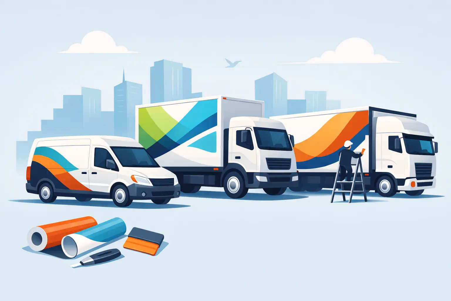
The third job is fit. A box truck, pickup door, cargo van side panel, and trailer all present different design opportunities. Flat panels give you room to go bigger. Curved doors and body seams force you to simplify. Good signage works with the vehicle instead of fighting it.
Start with the vehicle and the viewing distance
Before you pick fonts or colors, look at the actual vehicle. Measure the door space, note body lines, and decide where people will most often see it. A van parked in neighborhoods may get close-range attention. A highway service truck needs lettering that reads from farther away.
This is where many buyers either go too small or try to say too much. If your text is packed into a tight area, it may look fine on a screen but disappear on the street. Bigger, cleaner lettering usually beats a crowded design with every service you offer crammed into one panel.
A practical rule is to rank your message in order. Company name first. Main service second. Contact info third. Everything else has to earn its place.
A commercial vehicle signage guide to the main options
There is no single right format for every business. It depends on budget, vehicle type, and how bold you want the branding to be.
Vinyl lettering is the cleanest place to start. It works well for company names, phone numbers, city and state, USDOT numbers, and simple service descriptions. It is cost-effective, sharp, and ideal for doors, tailgates, and side panels.
Printed decals add more flexibility. If you want logos, gradients, detailed graphics, or photo-based branding, printed vinyl gives you more visual range than cut lettering alone. This is a strong option for businesses that already have a developed brand look and want it carried across multiple vehicles.
Magnetic signs can make sense for part-time business use or shared vehicles, but they are not always the best long-term answer. They are removable, which is useful, but they can shift, trap moisture if neglected, and do not usually look as integrated as applied vinyl. For full-time commercial use, permanent lettering usually looks more professional and stays more consistent.
Partial wraps and full wraps create the biggest visual impact, especially on large vans, trailers, and fleet vehicles. They also require a larger budget and more planning. For many small businesses, door lettering plus side or rear graphics hits the best balance between price and visibility.
What information should go on the vehicle
This is where strategy matters. More information does not automatically mean better signage. The goal is to help people identify your business and contact you without slowing down to decode the truck.
In most cases, the essentials are your business name, a direct phone number, and a short service label like Plumbing, Roofing, Electrical, Landscaping, Mobile Detailing, or Delivery. If your web address is short and memorable, it can be worth including. If it is long or cluttered, skip it and let the phone number do the work.
Logos are valuable if they are clean and readable at size. Tiny taglines are usually not. License numbers or regulatory markings should be added where required, but they should be separated visually from the main branding so the truck does not look overloaded.
Fleet operators often benefit from standardized layouts. Keeping every truck consistent helps with recognition and makes future vehicle additions easier. It also reduces ordering errors because sizes, placements, and color choices are already defined.
Design choices that hold up on the road
The best commercial graphics are not always the flashiest. They are the ones that stay readable in bright sun, at a stoplight, and from across a parking lot.
Contrast is everything. Dark lettering on a light vehicle or light lettering on a dark vehicle gives you the strongest read. If your brand colors are low-contrast, you may need outlines, shadows, or adjusted color placement to keep the text visible. That is one of those it depends decisions where brand purity sometimes needs to give way to real-world readability.
Font choice matters just as much. Bold, simple fonts usually perform better than thin scripts or highly stylized lettering. A custom look can still work, but if the text becomes hard to read, the design stops doing its job.
Spacing also makes a difference. Crowded letters and tight line breaks can turn a clean layout into a blur. Leave room around the key message. Dead space is not wasted space if it helps the lettering breathe.
Material quality is not the place to cut corners
Commercial signage gets punished every day. Cheap vinyl may look fine when it is first applied, but edge lift, fading, shrinking, and cracking show up fast when the material is not built for outdoor vehicle use.
For most commercial applications, professional-grade exterior vinyl is the safer choice. It handles weather better, keeps color longer, and applies more cleanly over time. Laminated printed graphics add protection against abrasion and UV exposure, which matters if the vehicle sees constant sun or frequent washing.
Adhesive type matters too. Permanent adhesive is standard for long-term vehicle graphics. Removable products have their place, but they are usually better for short-term promotions than daily work vehicles.
If you are lettering multiple units, consistency in material and production matters. A fleet should age evenly, not look like three different vendors handled three different trucks.
Placement can make or break the result
Door graphics are the standard because they are visible, easy to size, and work across most vehicle types. Rear graphics matter more than many buyers realize because people spend a lot of time behind vehicles in traffic. If you only budget for one extra location beyond the doors, the rear is often the smart pick.
Side panels on cargo vans and box trucks offer the biggest branding opportunity. This is where larger logos, service descriptions, or bold contact information can do real work. Just watch out for handles, seams, fuel doors, rivets, and curved body sections that interrupt the design.
Windows are another it depends area. Perforated window graphics can look strong and use otherwise empty space, but they need to be done properly and may not suit every vehicle or local requirement. If rear visibility is a priority, solid panel placement may be the better call.
Ordering and installation without guesswork
The smoother the ordering process, the fewer mistakes show up later. Start with accurate measurements, clear vehicle details, and a real plan for what goes where. If the same design is going on multiple units, document sizes and placement before production starts.
Online design tools make the process faster, especially if you already know your wording, color, and dimensions. For buyers who want control without hiring a designer, that speed matters. eDecals.com has built its business around that kind of direct customization, which is why business owners can move from idea to production without a lot of back-and-forth.
Installation is another point where realism helps. Simple door lettering can often be applied by a careful DIY buyer. Large printed panels, wrap sections, and complex multi-piece layouts usually benefit from experienced installation. A bad install can ruin good materials fast.
If you want signage that works hard, design it for real driving conditions, choose materials built for commercial use, and keep the message sharp. The best time to make your vehicle start selling your business is before the next job puts it back on the road.