
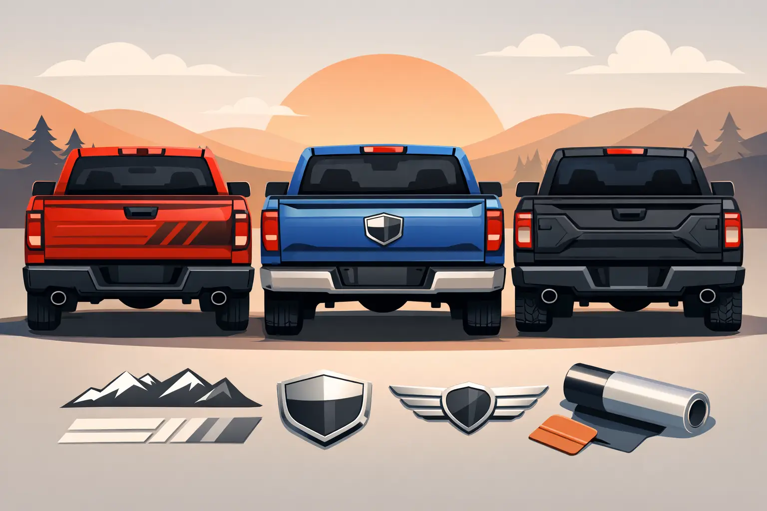
A blank tailgate is valuable real estate. It is the one part of your truck that drivers see while you are hauling equipment, parked at a jobsite, headed to the trail, or waiting at a light. The right truck tailgate lettering ideas can make that space work harder, whether you want to promote a business, show pride in your build, or give a factory tailgate a cleaner custom look.
The best layout depends on what the truck needs to do. A contractor’s truck should be readable from a distance. An off-road build can carry more attitude. A daily driver may only need a subtle model callout or a family name. Start with the purpose, then select lettering that fits the available space, paint color, and conditions your truck sees every day.
Start With the Job Your Tailgate Needs to Do
Before choosing a font, decide what must be seen first. If the tailgate represents your business, lead with the company name or primary service. Phone numbers, license information, and secondary services can follow, but they should not compete with the main message. A tailgate is not a business card. Too many lines of small text become unreadable the moment the truck pulls away.
For personal trucks, the message can be simpler. A nickname, ranch name, club name, patriotic phrase, trail designation, or custom build name can give the truck an identity without covering every inch of paint. Large lettering with a confident layout generally has more impact than several unrelated decals.
Measure the flat area before designing. Tailgate handles, backup cameras, emblems, body lines, steps, and molded trim all affect placement. Leave breathing room around those features so the lettering looks intentional instead of squeezed in.
Truck Tailgate Lettering Ideas That Get Noticed
1. Big, clean business name
For contractors, landscapers, mobile mechanics, and service businesses, a large company name across the center of the tailgate remains one of the strongest options. Use a bold, easy-to-read font and a color with clear contrast against the truck. Place a phone number beneath it only if there is enough room for large, legible digits.
This design works because it can be understood in seconds. It also scales well across multiple vehicles, giving a small fleet a consistent, professional look.
2. Service-first wording
If your company name does not explain what you do, lead with the service instead. “Tree Service,” “Concrete,” “Excavation,” “Mobile Detail,” or “HVAC Repair” tells potential customers why they should remember your truck. Put the business name below or in a smaller line.
This is especially useful for new companies that have not built name recognition yet. The trade-off is personality. A service-first layout is practical, but a distinctive company name and logo can be better for long-term brand recognition.
3. Raised factory-letter look
Many truck owners want the bold, spaced-out appearance of factory tailgate lettering without replacing trim pieces or buying expensive badging. Individual vinyl letters across the stamped brand area can create that effect. Matte black on silver, white on black, metallic gray on red, and color-matched lettering on a contrasting panel are dependable combinations.
Keep this style simple. It is about improving the truck’s original lines, not adding a long message. Measure letter spacing carefully so the word sits centered across the tailgate.
4. Two-color outlined lettering
Outlined lettering earns its place when you need extra separation from a busy paint color or want a motorsports-inspired finish. A white outline around black letters is a classic high-contrast choice. Black outline around a bright color can also make the main lettering stand out on light paint.
This option is more visual than plain cut vinyl, so use it strategically. It works well for truck names, race teams, outdoor brands, and performance builds. For commercial trucks, make sure the outline does not reduce readability at a distance.
5. Ranch, farm, or property name
A tailgate is a natural place for a ranch brand, farm name, hunting property, or family operation. Western fonts can fit the theme, but readability should still lead the design. A clean serif font or sturdy block style often lasts longer visually than an overly decorative script.
Add an established date, a small cattle brand graphic, or a simple silhouette only when the main name is still easy to read. The goal is a mark that looks at home on the truck, trailer, gates, and equipment.
6. Off-road build name
Lifted trucks, overland rigs, and trail builds benefit from a strong build name placed low and wide across the tailgate. Think short names with hard edges, such as “RIDGELINE,” “DIRTBOUND,” or a trail group name. Matte colors, camo patterns, distressed effects, and angular fonts can fit the build when they match the rest of the truck.
Avoid designs that are so aggressive they become difficult to read. Mud, dust, and low light already reduce visibility. A simple high-contrast decal usually looks better after a season of real use.
7. American flag or hometown detail
A subtle flag element, state outline, hometown name, or area code can personalize a truck without turning the tailgate into a collage. Place it beside a larger wordmark, beneath the handle, or in one lower corner. This works particularly well for owner-operators, veterans, local trades, and drivers who want a regional connection in their graphics.
Keep proportions under control. A small secondary graphic should support the lettering rather than become the first thing people see.
8. Racing number and team identity
For race haulers, track trucks, and motorsports support vehicles, a tailgate can carry the race number, driver name, class, and sponsor decals. The number should be the dominant element, especially if the truck is parked in the pits or used to tow the race vehicle.
Use the same colors and type treatment found on the car, bike, or ATV. That consistency makes the whole setup look organized. If sponsors are included, prioritize the ones that matter most and give each mark enough space to remain recognizable.
9. Hauling and towing information
A work truck that regularly pulls equipment can use tailgate lettering to communicate capability. “Hotshot,” “Equipment Hauling,” “Land Clearing,” “Dump Trailer Service,” or “Delivery Available” quickly explains how the truck earns its keep.
Be accurate with any claims. Do not advertise load capacity or services you cannot legally provide. Required commercial details may belong on doors or other areas depending on your operation, while the tailgate can focus on a clear service message.
10. Minimal monogram or initials
Not every custom tailgate needs a full statement. Oversized initials, a monogram, or a single word in a premium-looking font can make a daily driver feel personalized while keeping the factory look intact. This is a strong choice for newer trucks with clean body lines and owners who want customization without a loud graphic package.
Gloss black on black paint creates a subtle tone-on-tone effect. White, silver, or brushed-metal-look vinyl offers more contrast. The choice comes down to whether you want people to notice it immediately or only when they get close.
11. Reflective lettering for work and visibility
Reflective vinyl can be a practical upgrade for service vehicles, roadside crews, plow trucks, and trailers. It improves nighttime visibility when headlights hit the lettering and can make a simple company name easier to spot after dark.
Reflective material is not necessary for every truck, and it creates a more commercial appearance than standard vinyl. But when safety and visibility matter, it is a smart use of tailgate space.
12. QR code with a clear call to action
A QR code can support a commercial tailgate design, but it should not replace readable contact information. Use it with a short instruction such as “Scan for a Quote” or “See Our Work.” Make the code large enough to scan from a reasonable standing distance and test it before committing to the final layout.
This approach works best when the truck is frequently parked at jobsites, events, supply houses, or customer locations. It is less useful for vehicles that are mostly seen in traffic, where nobody has time to scan.
Choose Fonts and Colors for Real-World Readability
The best tailgate lettering is not just attractive on a design screen. It has to work in sun, rain, road grime, and motion. Bold sans serif fonts are usually the safest choice for business names and phone numbers. Block fonts suit off-road, hauling, and racing themes. Script can look great for a ranch or personal name, but reserve it for short wording and avoid thin strokes.
Contrast does the heavy lifting. White, bright silver, yellow, and light gray stand out on dark paint. Black, dark blue, and deep red work well on white or light-colored trucks. If the paint is bright, metallic, or heavily textured, an outline may be worth the extra visual separation.
Letter height matters as much as color. Large words can be read farther away, while small details disappear quickly. For commercial layouts, build around the main message first and use secondary text only after the primary line is sized correctly.
Make the Vinyl Last on the Tailgate
Tailgates take abuse. They get leaned on, washed, exposed to sun, and rubbed by cargo. Start with a clean, dry surface free of wax, silicone, dust, and grease. Apply lettering when temperatures are moderate and avoid immediately washing the truck or exposing the decal to hard weather while the adhesive settles.
Do not place standard lettering where repeated cargo contact will scrape it. If your truck regularly carries motorcycles, lumber, stone, or equipment, keep graphics above the heaviest contact zone or choose a layout that works around a protective tailgate mat.
With eDecals.com, you can build custom tailgate lettering by selecting the font, color, size, and layout that match your truck instead of settling for a one-size-fits-all decal. Start with one clear purpose, measure twice, and let the tailgate say something worth reading.