
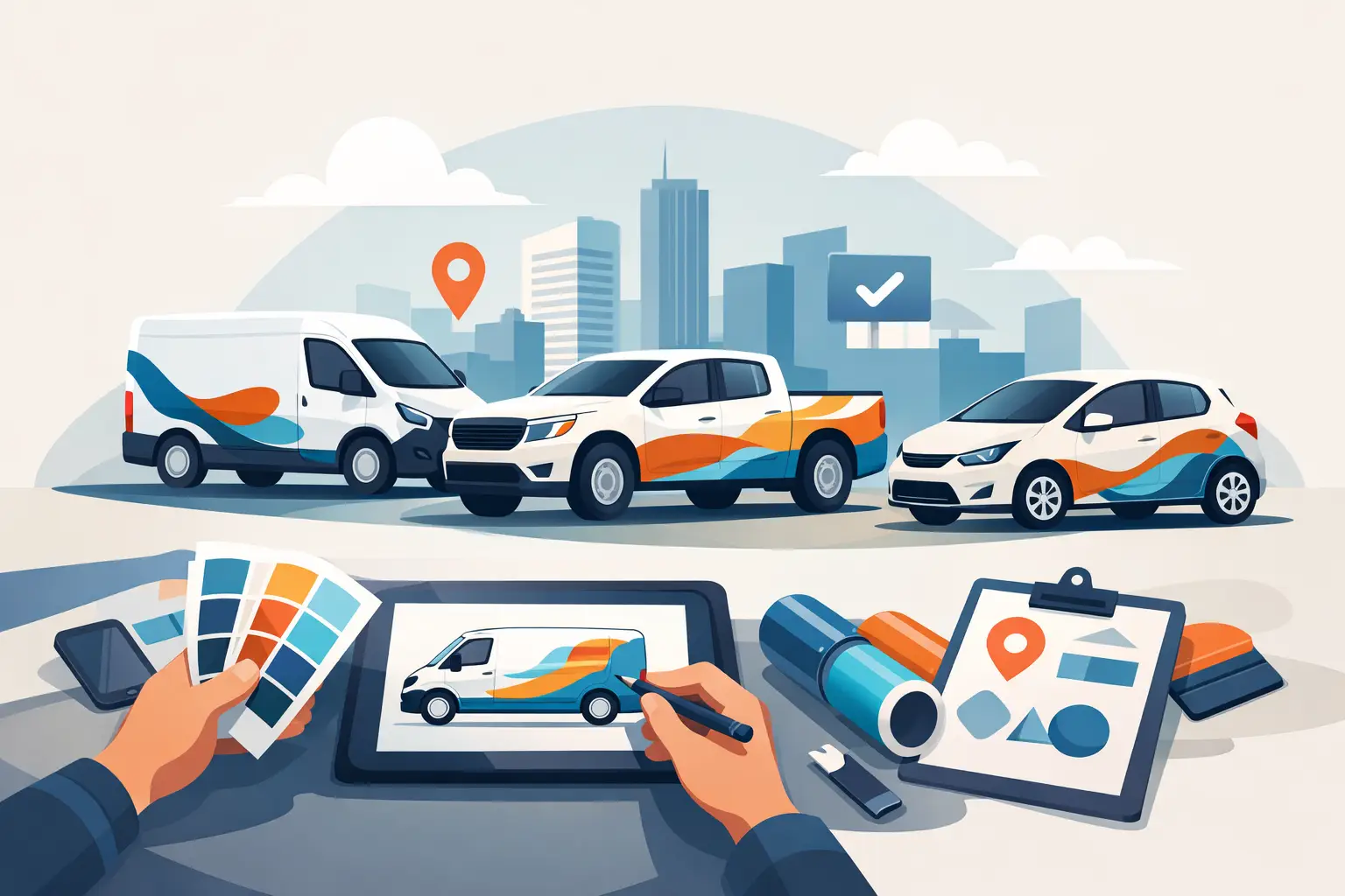
A plain white work truck parked at a jobsite is just transportation. The same truck with sharp lettering, a readable phone number, and clean branding is a rolling sales tool. That is the real value of small business vehicle branding – it puts your name in front of local customers while your crew is already on the road, on-site, or parked in neighborhoods where your next job may come from.
For contractors, service companies, delivery businesses, mobile detailers, landscapers, and trade professionals, vehicle graphics do more than make a truck look official. They build recognition, signal credibility, and help people remember who to call. The catch is that not every design works in the real world. Good branding on a vehicle has to be visible at a glance, durable outdoors, and matched to how that vehicle is actually used.
What small business vehicle branding needs to do
The first job is simple: get noticed fast. People rarely stand still and study a work van like a brochure. They see it in traffic, at stoplights, in driveways, or passing through a parking lot. That means your graphics have to communicate in seconds, not minutes.
The second job is trust. A clean, well-lettered vehicle tells people you are established and serious about your business. That matters for home service companies in particular. If someone is choosing between two plumbers or two electricians, the one with professional-looking trucks often feels like the safer call.
The third job is consistency. If your yard signs, business cards, uniforms, and truck lettering all look unrelated, your brand gets diluted. Vehicle graphics work best when they reinforce the same business name, colors, and visual identity customers see everywhere else.
Start with the essentials, not the extras
A lot of small businesses try to put everything on the doors and quarter panels. That usually leads to clutter. On a vehicle, less often sells more.
Your business name should be the biggest and clearest element. After that, most vehicles need a primary service description, a phone number, and sometimes a website if it is short and easy to read. In many cases, city names, license numbers, or compliance information also matter. If you operate commercial vehicles, certain markings are not optional, and those details need to stay legible.
What you do not want is a wall of text. Long taglines, multiple phone numbers, tiny social handles, and oversized lists of every service you offer can make the whole design harder to read. If someone cannot tell who you are from 30 feet away, the layout needs work.
The best layout depends on the vehicle
Small business vehicle branding is not one-size-fits-all because a cargo van, pickup, box truck, and trailer all present different surfaces. A pickup door may only have room for core identity details. A cargo van gives you a larger side panel, so you can combine branding with service information and stronger visual elements. A trailer can act almost like a mobile billboard if you keep the message bold and clean.
This is where practical design matters more than decorative design. Handles, body lines, windows, fuel doors, wheel wells, and rivets all interrupt a graphic. A layout that looks balanced on a flat screen can fall apart once it is placed on an actual vehicle. The most effective graphics account for those obstacles before production.
Color choice also changes by vehicle type. White vehicles are flexible and usually offer the strongest contrast. Dark trucks can look aggressive and sharp, but they need lettering colors that stay readable in full sun and low light. Metallic paint, tinted glass, and textured panels all affect the final result.
Lettering, decals, magnets, or wraps?
There is no single right format for every business. Cut vinyl lettering is a strong choice when you want a clean, professional look without covering the whole vehicle. It is cost-effective, durable, and ideal for business names, phone numbers, USDOT numbers, and simple service identification.
Printed decals make more sense when your branding includes logos, gradients, detailed artwork, or multiple colors that are hard to recreate with standard cut lettering. They also give you more flexibility for custom shapes and more visual punch.
Magnetic signs can work for businesses that use personal vehicles part-time, but they come with trade-offs. They are removable, which is useful, but they do not always look as integrated as permanent graphics. They also require proper placement and care to avoid edge lift, trapped moisture, or paint issues.
Wraps and partial wraps give the biggest visual impact, especially for businesses that want full-panel branding or high-end presentation. They cost more, but for companies with a larger service area or heavy daily driving, the extra visibility can be worth it. It depends on your budget, how long you plan to keep the vehicle, and how aggressively you want to market with it.
Good design is built for motion
A vehicle is rarely viewed straight on at eye level. It is seen from angles, at speed, and in changing weather. That changes the rules.
Fonts need to be readable, not just stylish. Script can look great for certain brands, but if it gets hard to read from a distance, it is the wrong choice for primary information. Bold, clean letterforms usually perform better. Spacing matters too. Crowded lettering can become a blur once the truck starts moving.
Size is another common mistake. Business owners often underestimate how large text needs to be. What looks oversized on a laptop screen may look perfectly normal on a van side. Phone numbers especially need room to breathe. If they are too small, you are paying for branding that cannot convert.
Contrast does most of the heavy lifting. Black on white, white on black, and other high-contrast combinations tend to outperform low-contrast palettes. Brand colors still matter, but readability has to come first.
Durability is part of the branding decision
If your vehicles live outside, go through jobsite dust, face road salt, or get washed regularly, materials matter. Cheap graphics can fade, shrink, crack, or peel before they have done their job. That is not just a product problem. It becomes a brand problem when your company truck starts looking worn out.
Professional-grade vinyl and properly produced graphics hold color better and stand up to daily use. Surface prep and installation matter just as much. Even a well-made decal can fail early if it is applied to a dirty, waxed, or poorly prepared surface.
This is where experienced production makes a difference. Businesses that order custom vehicle lettering need more than color options. They need materials and sizing that fit actual use, whether that means a pair of truck doors, a fleet of vans, or compliance lettering that has to stay readable and legal.
Small business vehicle branding should match your market
A local HVAC company and a race trailer sponsor are both using graphics, but they are solving different problems. For most service businesses, clarity beats flash. Homeowners want to know who you are and what you do. Strong identity, clean lettering, and a direct call path usually outperform busy graphics.
That said, some brands benefit from more visual edge. Detail shops, powersports businesses, performance shops, and custom automotive services can push harder on style because their audience expects personality. The trick is knowing when to keep it strictly functional and when to lean into a stronger look.
If you run multiple vehicles, consistency matters more than creativity from one truck to the next. A fleet should look like a fleet. Matching colors, logo placement, font choices, and panel hierarchy help your brand build repetition in the market.
Getting better results from the design process
The fastest way to waste money is to guess your way through layout decisions. Before ordering, think through where the vehicle will be seen most often, what detail customers need first, and how much space the vehicle actually gives you.
A smart design process starts with your core information and builds outward. Lock in the business name, primary contact, and service identifier first. Then choose fonts, colors, and sizing that support quick reading. From there, add logo elements or secondary details only if the layout still feels clean.
Online customization tools make this process much easier because you can test colors, fonts, effects, and sizes before production. That is especially useful for buyers who want control without hiring a separate designer. For businesses that need anything from simple truck door lettering to broader commercial graphics, that speed matters. eDecals.com is built around that kind of instant design flexibility, which is why it fits both first-time buyers and experienced commercial customers.
A vehicle should earn its keep even when it is sitting still. If your branding is clear, durable, and built for the way people actually see a truck or van, every stop becomes a chance to be remembered.