
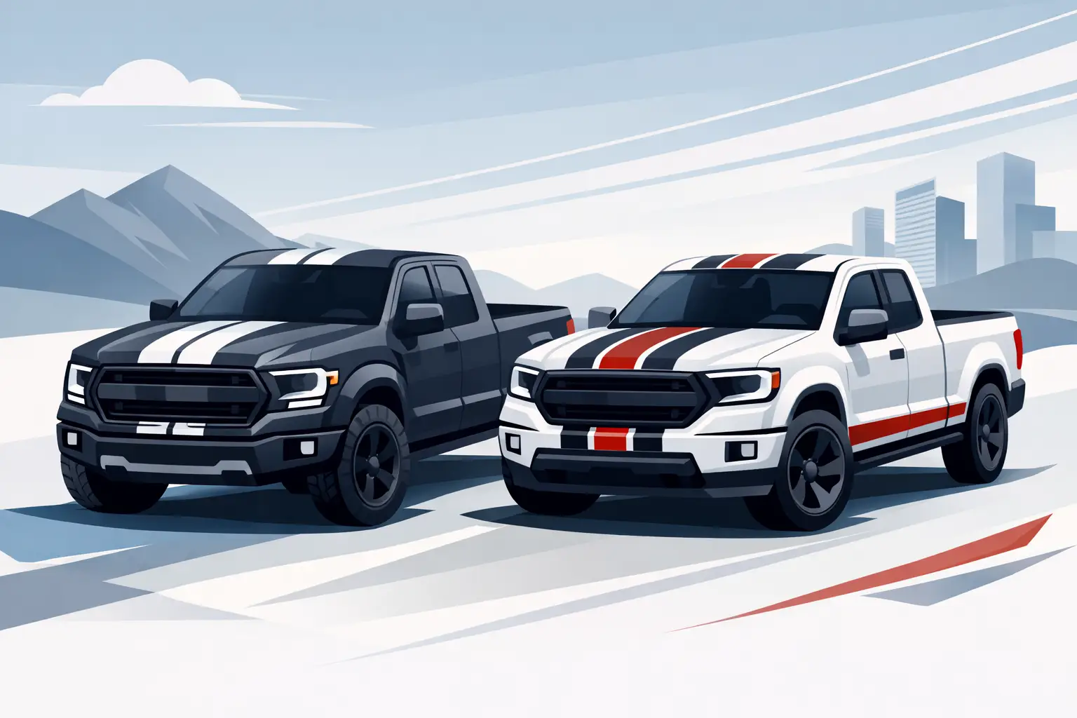
A truck has more visual real estate than a car, which makes stripe placement matter more. A narrow pair of lines that looks sharp on a coupe can disappear on a full-size hood, while oversized graphics can make a compact pickup look crowded. The best racing stripes for trucks are sized for the body panels, matched to the truck’s purpose, and made from outdoor-ready vinyl that can handle real driving.
Whether you are building a show truck, personalizing a daily driver, matching a race number kit, or giving a work pickup a more aggressive finish, stripes create a clear focal point without committing to a full wrap. The key is choosing a layout that looks intentional from the grille to the tailgate.
Start With the Truck’s Shape
Truck styling is not one-size-fits-all. Hood length, cab configuration, bed rails, fender flares, and factory trim all affect where a stripe should begin and end. Before choosing colors or finishes, look at the truck straight on, from the side, and from an elevated angle. A design that works on the hood alone may need adjustment once it reaches the roof or tailgate.
A classic center stripe layout is the most recognizable option. Two parallel stripes run over the hood, roof, and tailgate, separated by a consistent gap. This approach works especially well on sport trucks, lowered street builds, and trucks with a clean, uncluttered body line. It also gives you a simple way to tie in a windshield banner, door number, or small bed-side graphic.
For lifted trucks and off-road builds, a hood-focused stripe often makes more sense. The hood is the visual center of the vehicle, and a shorter graphic avoids competing with roof racks, light bars, toolboxes, or bed accessories. Side stripes can be a better choice for trucks with long beds, especially when the graphic follows the beltline, lower rocker area, or rear fender contour.
The factory body lines are your best guide. Use them to keep the stripe straight, centered, and proportional. Do not force a graphic through a crease or across a badge just because it looked good in a flat mockup.
Choose a Stripe Width That Reads at a Distance
Width is where many truck stripe designs go wrong. Trucks sit higher and have larger panels, so their graphics need enough scale to be seen from more than a few feet away. At the same time, width should support the truck’s proportions instead of covering the entire hood.
For many mid-size pickups, a paired stripe setup with 4- to 6-inch stripes and a narrow center gap provides a balanced appearance. Full-size trucks commonly handle 6- to 10-inch stripes more comfortably, depending on hood width and the amount of factory trim. A single wide stripe can work well, but it needs a clean centerline and a deliberate finish. It is less forgiving than a paired layout when placement is off.
There is no universal measurement because a wide, flat hood and a raised cowl hood create very different visual results. A practical move is to mark the proposed width with low-tack painter’s tape first. Step back 20 feet, then look again from the driver’s seat height. If it only looks right when you are standing close to the truck, it likely needs more presence.
Keep the Spacing Consistent
The gap between two stripes is as important as the stripe width. A tight gap feels modern and compact; a wider gap has more of a vintage muscle-truck look. Whichever style you choose, keep the spacing consistent across every panel. Small changes become obvious when the design crosses the windshield, roof, or tailgate.
If the stripes stop at the hood, give them a purposeful ending rather than an abrupt cutoff. A tapered point, angled edge, or contour that follows the hood vent area can make the layout look designed for the truck rather than added as an afterthought.
Pick Color and Finish for Real-World Use
Color should work with the truck’s paint, not fight it. High contrast is the safe choice: black or charcoal on white and silver, white on darker paint, and red, blue, or orange accents on neutral body colors. Matte black remains a popular choice because it adds attitude without the reflection of gloss vinyl, but it can show dust and fingerprints more readily than some finishes.
Gloss stripes create a deep, paint-like contrast, especially on matte or satin factory paint. Metallic and carbon-fiber-style finishes can add texture, although they are best used with restraint. A heavily patterned stripe may clash with busy wheels, camouflage wraps, bright paint, or large aftermarket accessories.
Reflective vinyl is worth considering for trucks that see night driving, track events, roadside work, or low-light conditions. It delivers visibility along with a distinct look under headlights. For commercial pickups, reflective accents can also support a more noticeable, professional vehicle presence without turning the truck into a full graphics package.
Match the finish to how the truck is used. A garage-kept weekend truck can lean toward high-impact specialty finishes. A daily-driven work truck benefits from durable, easy-to-clean vinyl in a color that will not show every splash of mud, road film, and jobsite dust.
Design Racing Stripes for Trucks Around Existing Graphics
Stripes look stronger when the rest of the truck supports them. If you already have door lettering, a business logo, race numbers, sponsor decals, or windshield graphics, plan the stripe color palette around those elements. You do not need every graphic to match exactly, but the design should feel connected.
For a contractor or service truck, a stripe can frame the branding rather than compete with it. A narrow accent that begins at the front fender and carries toward the doors can add energy while leaving door space clear for company lettering, phone numbers, license information, or USDOT details. On a race support truck, center stripes can match the competition vehicle and make trailer-side graphics feel more coordinated.
Avoid stacking too many messages in one area. Large hood stripes, a windshield banner, and oversized side lettering can work together, but each needs room to breathe. When every surface calls for attention, the truck loses its strongest visual feature.
Consider Cab and Bed Configuration
Regular-cab short-bed trucks can carry bold, compact layouts because their proportions are already sporty. Crew-cab long-bed trucks have more side length, so horizontal stripes and bed-side graphics often look better than a small accent lost near the front door. On a heavy-duty pickup with wide mirrors, tall cab height, and large fenders, a broader hood graphic usually reads better than thin lines.
Tailgate stripes deserve planning, too. Continuing a center layout over the tailgate gives the truck a finished appearance, but only when the stripe aligns with the bed rails and clears handles, cameras, trim, and badges. For some builds, ending at the cab is cleaner. It depends on whether the truck is meant to look like a complete race-inspired package or a street-focused hood treatment.
Vinyl Quality and Preparation Matter
A great design will not stay great if it is installed on contaminated paint or low-grade material. Vehicle-grade vinyl is made for outdoor exposure, with adhesive and film construction designed to resist weather, washing, and normal road use. Cheap decal material may fade, shrink, crack, or lift at edges long before the truck is ready for a new look.
Wash the application area thoroughly and remove wax, silicone, grease, and road film. The paint should be dry and cool to the touch. Avoid applying stripes in direct summer sun, high wind, or cold conditions that make the vinyl difficult to position. Fresh paint should be fully cured before graphics go on it.
Installation becomes more demanding when stripes cross multiple panels. A hood-only kit is manageable for many careful DIY owners. Hood-to-roof-to-tailgate layouts require precise measuring, alignment marks, and patience around panel gaps. If a stripe has to cross a raised hood section, scoop, vent, or sharp body crease, professional installation may be the smarter investment.
At eDecals.com, custom vinyl graphics can be designed around the colors, sizing, and visual direction of your truck, so you are not limited to a generic one-size kit. Start with the panel measurements and the look you want before committing to the final layout.
Make the Design Look Intentional
The best stripe packages do not need to be loud. They use the truck’s lines, leave enough open paint visible, and repeat colors already found in the wheels, grille accents, interior stitching, or existing graphics. A simple black-and-red paired stripe on a white truck can make a stronger statement than a complicated design with six colors.
Before ordering, take a clear photo of the truck from the front, side, and rear. Use painter’s tape to test your proposed path, then check it in daylight and at a distance. That ten-minute step can save you from choosing a stripe that is too narrow, too busy, or placed where an emblem interrupts the design.
Build for the truck you actually drive. A clean, durable stripe layout that fits your body style will keep looking right at the fuel pump, on the jobsite, in the staging lanes, and after a long highway run.