
A boat name that looks crooked, a truck door logo you can’t read from ten feet away, a race number that fails tech inspection – most vinyl lettering problems start long before anything touches the surface. If you want to make your own vinyl lettering, the real job is getting the layout, sizing, material, and application method right the first time.
That matters whether you’re lettering a work truck, adding registration numbers to a boat, putting a windshield banner on a street car, or setting up clean door graphics for a service business. Good vinyl lettering should look sharp, hold up outdoors, and fit the surface like it belongs there. The fastest way to get there is to think like a sign shop before you think like a buyer.
What it really takes to make your own vinyl lettering
The idea sounds simple because it is simple – up to a point. You pick text, choose a font, select a color, set the size, and apply it. Where people get into trouble is assuming all lettering works the same on every vehicle, every panel, and every use case.
A truck door has different visibility needs than a rear window. Boat lettering has to deal with water, sun, and curved surfaces. Race numbers need contrast and compliance more than style. Business lettering has to be readable at speed, not just attractive on a screen.
So before you design anything, decide what the lettering is supposed to do. Is it identification, branding, compliance, decoration, or all four? That answer affects every choice that follows.
Start with the job, not the font
The most common mistake is choosing a font because it looks cool in a preview. That works for some custom projects, but it doesn’t work for every surface or purpose. Script fonts can look great for boat names and personal graphics, but they can be harder to read on moving vehicles or from a distance. Bold block fonts usually perform better for truck lettering, contractor vehicles, and utility decals.
Size matters just as much. Small text gets lost fast, especially on dark paint, tinted glass, or textured surfaces. If the lettering is meant to be read from the road, think bigger than your first instinct. If it’s for compliance, check the required height and spacing before you design. USDOT numbers, registration numbers, and similar markings are functional first.
Spacing is another detail that changes the result more than most people expect. Crowded letters can look heavy and cheap. Over-spaced letters can feel disconnected. A clean layout with enough air between characters usually reads better and installs better.
Choosing vinyl that matches the surface
If you want to make your own vinyl lettering and have it last, material choice is not optional. Indoor craft vinyl and outdoor-grade lettering film are not the same product, and they do not perform the same way.
For vehicles, trailers, boats, and outdoor equipment, you want durable adhesive vinyl built for exterior use. It needs to handle sun, weather, washing, and temperature changes. A smooth painted metal panel is usually straightforward. Glass is also a strong application surface. Rough plastic, oxidized gel coat, and heavily textured materials can be more difficult and may shorten lifespan.
Color choice also affects durability in practical ways. Some colors show dirt more quickly. Some metallic and specialty finishes look great but may not be the best fit for hard-working commercial use. If you’re lettering fleet vehicles or equipment, simple high-contrast colors often give the best long-term result.
There’s also the question of finish. Gloss can pop harder on clean paint and glass. Matte can work well for a subtler custom look. Neither is universally better. It depends on the style of the vehicle and how much contrast you want.
Design for the panel you actually have
A flat online preview is helpful, but the real-world panel is what counts. Doors have handles, body lines, moldings, hinges, and curves. Boat hulls taper. Windshields narrow toward the pillars. Tailgates often have embossed factory branding that limits clean placement.
Measure the usable area, not the whole panel. Then leave margin around the lettering so it doesn’t feel crowded or get broken up by hardware. A design that fills every inch of space usually looks worse than one that fits with purpose.
This is especially important for multi-line commercial lettering. Company name, city, phone number, license information, and service list all compete for room. If everything is the same size, nothing stands out. Build visual hierarchy into the design. Put the most important line first, then support it with secondary information.
Make your own vinyl lettering for business use
Business lettering has less room for guesswork. It needs to look professional, read quickly, and hold up under daily use. That means simpler fonts, stronger contrast, and enough size to be legible at a glance.
For most work trucks and vans, the smartest approach is clean door lettering with only the essentials. Business name, phone number, and service type often do more work than an overloaded layout. If you add license numbers or compliance text, keep it organized so the primary message still leads.
Fleet buyers usually benefit from consistency even more than creativity. Matching size, placement, and color across multiple vehicles gives a stronger brand impression and makes future reorders easier. If you already know your measurements and preferred style, the ordering process gets much faster.
Make your own vinyl lettering for cars, boats, and motorsports
Personal and enthusiast projects give you more freedom, but the same rules still apply. A windshield banner needs to fit the glass shape and preserve visibility. Door numbers need enough contrast to stand out at speed. Boat names and registration numbers need to look clean against the hull color and remain readable on the water.
This is where customization matters. Font options, color choices, effects, and layout control let you match the personality of the vehicle without sacrificing function. A street truck can carry bold custom lettering without looking cluttered. A race car can run aggressive numbers that still meet track requirements. A boat can have a script name that feels custom but not overdone.
The trick is balance. The best-looking lettering usually isn’t the busiest. It’s the one that fits the machine and the purpose.
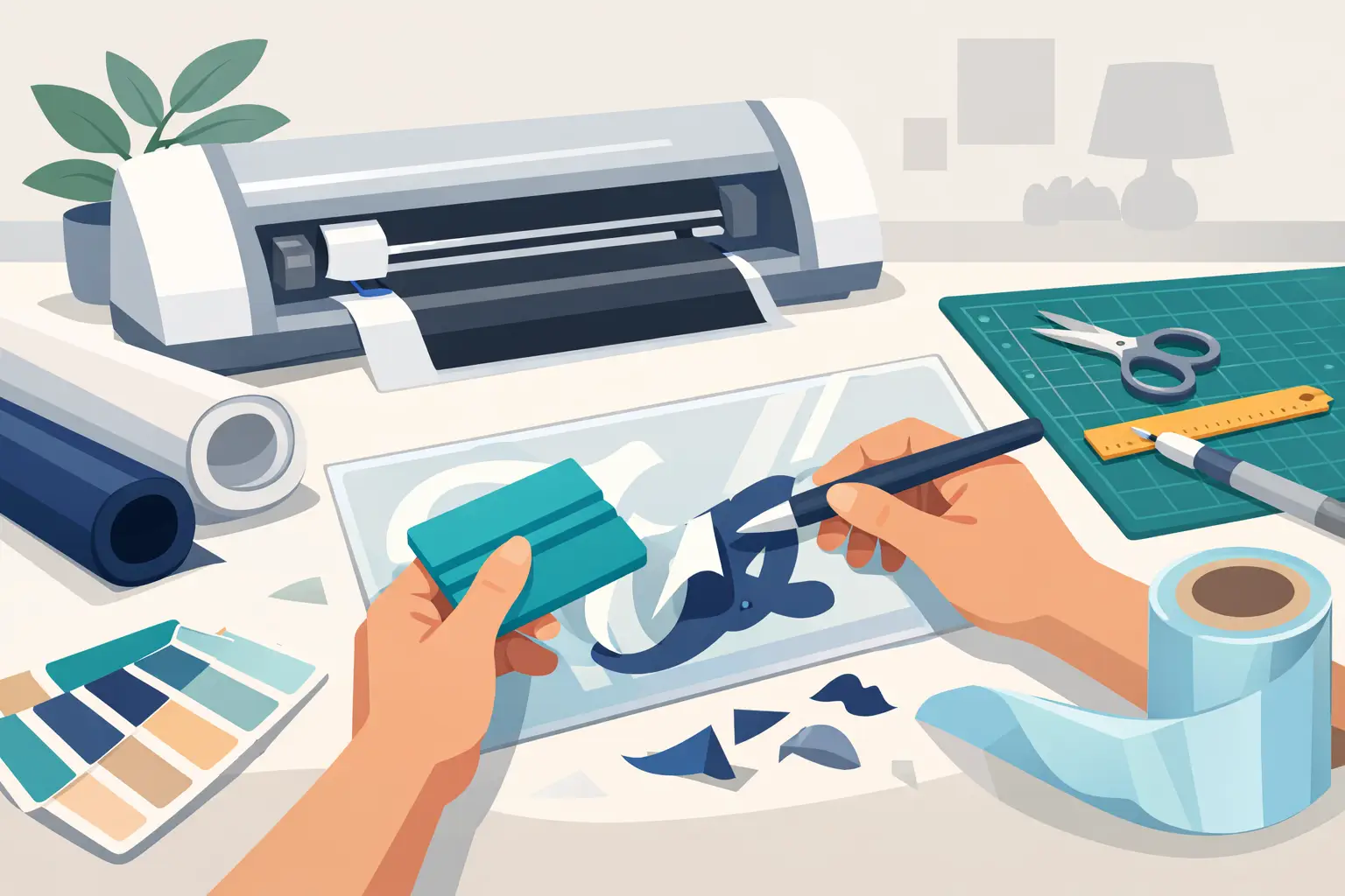
Installation is where good designs fail
You can choose the right text, the right font, and the right size, then ruin the result with a rushed install. Surface prep matters. If the panel has wax, grease, oxidation, dust, or water spots, adhesion suffers. Clean the surface thoroughly and make sure it is dry before application.
Alignment matters just as much. Use reference points on the panel and check level before committing. On vehicle doors, compare both sides so the placement matches. On boats, step back and view the lettering from a distance before final application. A slight tilt becomes obvious fast.
Temperature also matters. Very cold surfaces can reduce tack. Extremely hot panels can make positioning harder. Smooth, controlled application usually beats trying to force the job in bad conditions.
If the lettering includes transfer tape, remove it carefully and give the vinyl time to bond. Don’t rush straight into washing or heavy exposure. Good installation habits extend the life of the product.
When DIY design makes sense and when expert production helps
If you know your text, your size, and your application surface, it’s easy to make your own vinyl lettering with an online design tool. That works especially well for straightforward jobs like truck door lettering, boat registration numbers, race numbers, windshield banners, and standard custom text.
Where people benefit from professional-grade production is in the details: cleaner cutting, better outdoor materials, broader font and color selection, and category-specific options built for real use. That’s the difference between making a design on a screen and getting lettering that performs on a vehicle, trailer, or vessel.
For buyers who want control without starting from scratch, platforms like eDecals.com make that process faster. You can set the text, adjust the style, dial in the size, and order lettering built for outdoor application without needing to hire a designer or visit a local shop.
Get the result you actually want
If your lettering needs to look sharp for more than a weekend, treat it like a real graphics job. Measure the panel, choose a readable font, use outdoor-grade material, and match the design to the vehicle and the task. That’s how you make custom lettering that looks right on the first install and keeps doing its job after the miles, weather, and wash cycles add up.
The best vinyl lettering is not the flashiest option on the screen. It’s the one that fits your truck, boat, car, trailer, or business like it was made for it – because it was.