
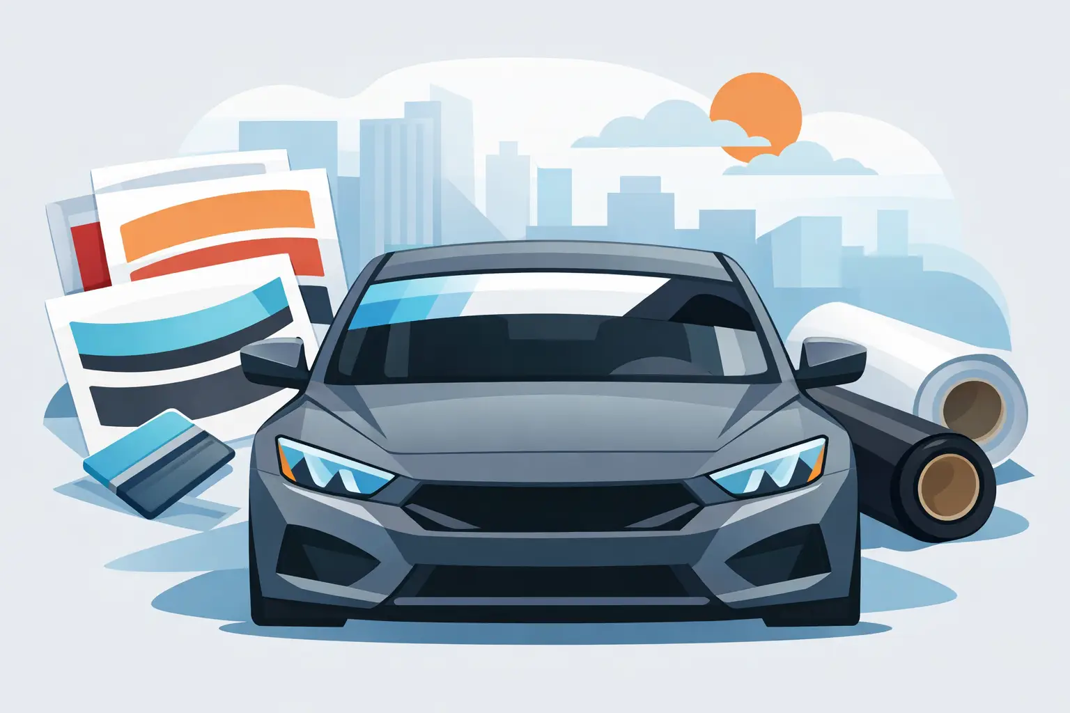
A windshield banner can make a truck look finished, give a race car a cleaner identity, or put a business name where people actually see it. Custom windshield banner decals are one of those upgrades that look simple from the outside, but the right size, vinyl, font, and placement make the difference between a sharp result and a banner that feels off every time you walk up to the vehicle.
That is why banner decals work best when you design them with the vehicle, the use case, and the viewing distance in mind. A weekend show truck, a dirt track car, and a service van do not need the same layout. The good news is that you do not need a designer to get it right if you know what to look for.
What custom windshield banner decals actually need to do
Some buyers want pure style. Others need branding, sponsor exposure, team identification, or a cleaner way to tie a build together. In every case, the banner has a job. It needs to read clearly, fit the windshield shape, hold up outdoors, and avoid looking crowded or undersized.
A lot of bad banner designs come from treating the windshield like a flat rectangle. It is not. Windshields curve, taper, and change height from center to edge. If the text is too tall, it can overwhelm the glass. If it is too small, it disappears. If the spacing is wrong, the decal may technically fit but still look awkward once installed.
That is why experienced buyers usually start with proportion first. The banner should look balanced from the front of the vehicle and stay readable from the distance where people will actually see it.
Choosing the right custom windshield banner decals for your vehicle
Vehicle type matters more than most people expect. A full-size pickup gives you more width and often a bolder visual stance, so larger lettering can work. A compact car or older import may look better with tighter height and cleaner spacing. On race vehicles, high contrast and legibility usually matter more than subtle styling. On business vehicles, clarity beats decorative effects almost every time.
You also have to think about how the decal will be used day to day. If the vehicle spends its life outdoors, material quality matters. If it is a work truck that racks up highway miles, adhesion and cut quality matter. If it is a show car, the finish and style choices may carry more weight.
This is where customization helps. Being able to control font, color, size, and layout lets you match the banner to the vehicle instead of settling for a generic strip that almost works.
Size and fit are the first real decisions
Most customers focus on wording first, but size should come before the final layout. A windshield banner that is too deep can block more visibility than you want. One that is too shallow may leave the design looking thin and underpowered.
The sweet spot depends on the windshield and the look you want. Taller banners create more impact but need better planning. Shorter banners feel cleaner and are easier to keep subtle. If the windshield has a strong curve near the top corners, that can affect how long text strings sit across the glass.
Measuring matters. Width alone is not enough. You want to know the usable area across the top section of the windshield and account for any mirror mount, tint strip, or edge curvature that could interfere with the design.
Font choice changes the whole result
Block fonts are popular for a reason. They read fast and hold their shape well across wide windshield spans. Script fonts can look great on the right build, especially for custom or lifestyle-focused vehicles, but they are less forgiving. Fine details, sharp swashes, and tight strokes may not read well at speed or from a distance.
For business use, simple wins. If your company name is on the banner, people should be able to recognize it in a quick glance. For enthusiast builds, you have more room to push personality, but readability still matters. A banner that nobody can read is just visual noise.
If you are adding multiple words, spacing becomes as important as the font itself. Letters that feel balanced on a screen can look compressed once stretched across a windshield. Strong design tools help you catch that before you order.
Color, finish, and contrast
The cleanest-looking banner is not always the loudest one. White on dark glass stays popular because it is crisp and easy to read. Black can look aggressive on lighter vehicles or where the windshield tint creates enough contrast. Bright colors can work well on race cars, branded vehicles, and builds that already carry strong accent colors.
Contrast should drive the decision. A banner can have the perfect wording and still fail if the color blends into the glass or gets lost against the vehicle body. Metallic and specialty effects can add style, but they are best used when they still support visibility.
It also helps to think about the rest of the graphics package. If the vehicle already has side lettering, race numbers, sponsor decals, or striping, the windshield banner should feel connected. Matching font families or color tones often creates a more professional result than using a completely different style just because it looked good on its own.
Placement and visibility trade-offs
This is where practical use meets personal preference. A windshield banner has to look right from outside the vehicle, but it also has to make sense from the driver seat. Taller banners create more visual presence, but they can also reduce upward visibility depending on the vehicle and seating position.
That trade-off is not the same for everyone. A dedicated race car may prioritize external visibility and branding. A daily driver usually needs a more conservative approach. Trucks and lifted vehicles often give you a little more room to work with than lower passenger cars, but you still want to be smart about placement.
State and local regulations can also affect what is allowed on windshields. Buyers should always make sure their banner size and placement comply with the rules that apply to their vehicle use. A good-looking decal is not much help if it creates a legal problem.
One-color cut vinyl or printed design?
For many windshield banners, cut vinyl is the right choice. It gives you clean lettering, sharp edges, solid outdoor durability, and a classic look that fits everything from race cars to work vans. If you want straightforward text, a bold name, or a clean phrase across the glass, cut vinyl handles that job well.
Printed banners make more sense when you need gradients, logos with multiple colors, or more complex visual effects. They give you more design freedom, but they are not always necessary for a simple banner. Sometimes the best result is also the simplest one.
That depends on your goal. If you are branding a company fleet, consistency and readability may matter more than graphic complexity. If you are building a sponsored motorsports vehicle, a printed option may better support logo-driven layouts.
Why online customization matters
Speed matters when you know what you want, and control matters when you do not want to settle. That is why online design tools have changed how people buy custom windshield banner decals. Instead of sending emails back and forth and hoping the final proof matches your vision, you can build the decal yourself with the exact text, font, color, and dimensions you need.
For both first-time buyers and experienced decal customers, that control reduces mistakes. You can test different looks, compare font styles, and set up a banner that matches the vehicle before it goes into production. At eDecals.com, that kind of instant customization is built for people who want professional-grade vinyl without slowing down the process.
Getting the install right
Even a well-made banner can disappoint if it is installed crooked, stretched, or off-center. Clean glass is the starting point. Any dirt, wax, or residue can affect adhesion. Alignment matters just as much. A windshield banner draws attention because it sits in one of the most visible spots on the vehicle, so even a small mistake tends to show.
Take time to position the decal evenly across the windshield and check the top edge before final application. If the vehicle has curves or tight corners near the roofline, work carefully so the decal lays flat without lifting. Quality material helps, but technique still counts.
A banner is a simple product with very visible results. When the fit is right, the font is chosen for the vehicle, and the material is built for outdoor use, it does exactly what it should – it makes the vehicle look more intentional. Whether you want attitude, identity, or business visibility, the best custom windshield banner decals are the ones designed with a real purpose instead of just filling space.