
A windshield banner has about two seconds to do its job. At highway speed, in a staging lane, or parked at a jobsite, the wrong typeface gets lost fast. If you are trying to choose the best font for windshield banner lettering, the real answer is not one magic font. It is the font that stays readable at a distance, fits the width cleanly, and matches the vehicle’s purpose.
That means a race car banner and a contractor truck banner usually should not use the same style. One needs attitude. The other needs clarity first. Good windshield lettering is part design, part visibility test, and part restraint.
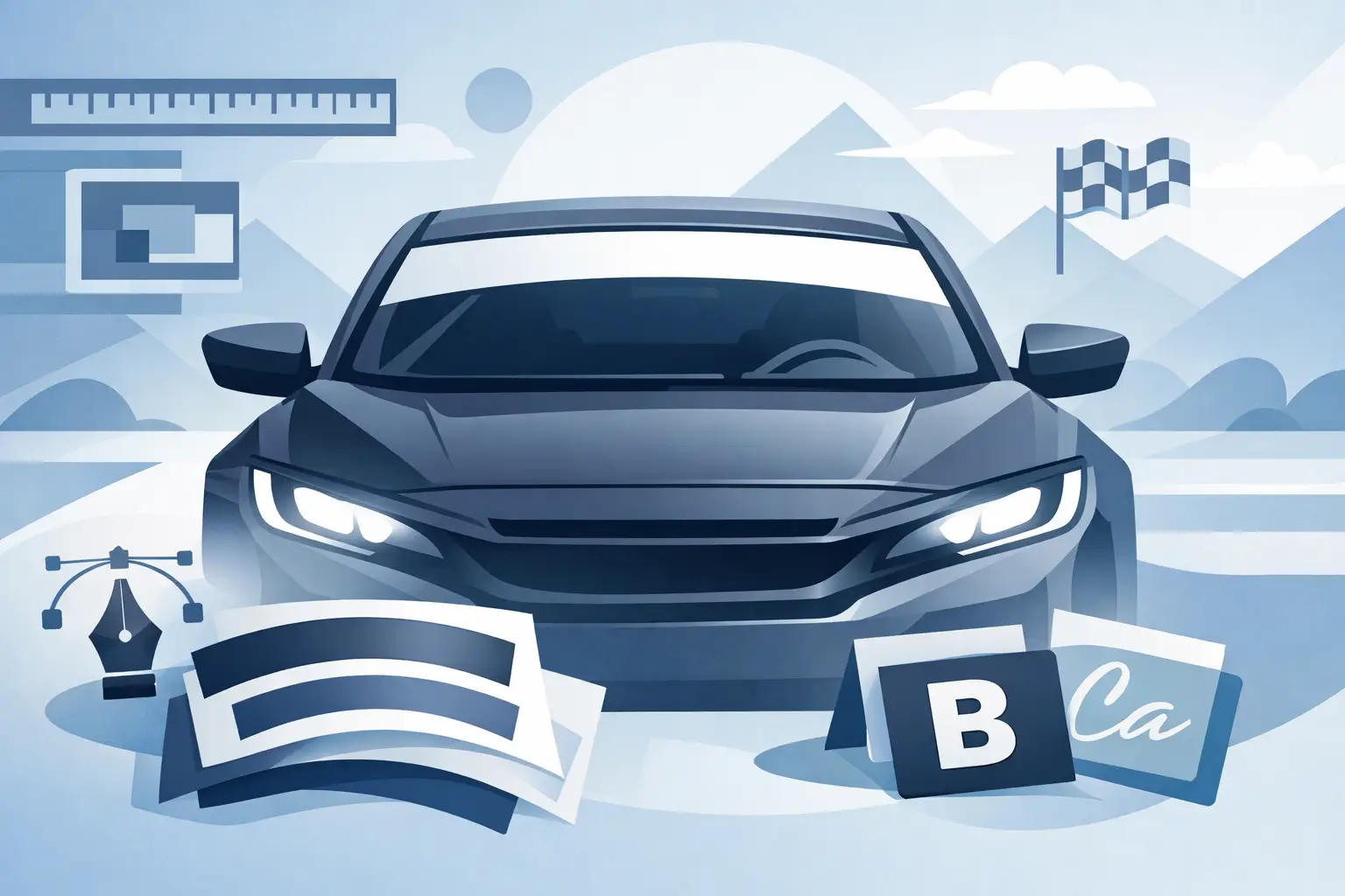
What makes the best font for windshield banner use?
The best-performing windshield banner fonts all share a few traits. They read cleanly from left to right, they hold their shape when cut in vinyl, and they do not force letters too close together. That last part matters more than most people expect. A font can look sharp on a screen and still turn muddy across a curved windshield.
Stroke width is a big factor. Very thin fonts often disappear against reflections or dark tint. Extra-thick block fonts can work well, but only if the letter spacing is opened up enough to keep the word from turning into one solid bar. Fonts with simple letterforms usually win because they survive glare, distance, and movement better than decorative styles.
Capital letters also tend to work better for banners than mixed case. All caps create a stronger top-line profile and usually fill the available space more evenly. For short names, team names, brand names, and single-word banners, that matters.
The strongest font styles for windshield banners
If you are narrowing down the best font for windshield banner graphics, start by choosing a font category before choosing a specific typeface. That gets you to the right look faster.
Bold sans serif fonts
This is the safest choice for most vehicles. Bold sans serif fonts are clean, modern, and easy to read. They work especially well for business names, websites, social handles, and simple branding across trucks, vans, and fleet vehicles.
A condensed sans serif can be useful when you need more characters across a limited width, but there is a trade-off. Go too narrow and readability drops. For a windshield banner, medium-width bold sans serif fonts usually hit the sweet spot better than ultra-condensed styles.
Athletic and racing fonts
For race cars, drift builds, off-road trucks, and enthusiast vehicles, athletic or motorsport-inspired fonts can make sense. These fonts usually have sharper cuts, angled forms, and a more aggressive look. They bring energy, but they need more care.
Some racing fonts look great up close and terrible from 30 feet away. If the cuts are too complex or the letters lean too hard, the name becomes harder to read. A good motorsport font should still be recognizable in one quick glance.
Block and varsity fonts
These work well for team names, club banners, and bold personal branding. They have strong visual weight and fill space nicely. On larger windshields, block fonts can create that classic banner look without getting too flashy.
The caution here is spacing. Varsity-style letters often need extra room between characters to avoid a crowded result, especially with names that have repeated vertical strokes like M, N, H, or I.
Script fonts
Script can work, but only in specific cases. If the banner is short, the vehicle is mostly for show, and the style is the priority, script may be the right move. For example, a clean custom coupe or show truck can carry a script banner well if the word count is low.
For most practical applications, script is not the best font for windshield banner readability. Loops, swashes, and connected letters reduce legibility fast. If you use script, keep it simple and avoid long phrases.
Matching the font to the vehicle
The right banner font depends a lot on what the vehicle is doing.
For a business truck or van, choose clean, high-contrast lettering that can be read in traffic or while parked. A strong sans serif or simple block font usually gives the best return because it looks professional and reads fast.
For a race car, your banner can carry more style. Aggressive fonts, italicized forms, or custom-looking letter shapes fit the environment better. Still, readability matters if you want the name, sponsor, or team identity to show up in photos and from the stands.
For a street build or personal vehicle, it depends on the look you want. A minimalist car often looks best with plain, bold lettering. A lifted truck or tuner build may support a more stylized font. The key is making sure the font matches the lines of the vehicle instead of fighting them.
For marine and off-road applications, durability and cut quality matter even more. Fonts with thin interior details or fragile serifs are more likely to create production and installation issues over time.
Size, spacing, and color matter as much as the font
A lot of people spend all their time picking a typeface and ignore the layout. That is where good banners go bad.
Letter spacing should almost always be adjusted for windshield use. Factory font spacing is built for print and screens, not curved glass. Opening the letters slightly often improves readability and gives the banner a more balanced appearance across the top of the windshield.
Font height matters too. A banner that is too shallow can look weak, while one that is too tall may interfere with visibility or feel oversized for the vehicle. The right proportion depends on the windshield dimensions and whether the text is one word, two words, or a longer phrase.
Color choice can rescue an average font or ruin a good one. White is popular because it pops on tinted glass and stays readable in low light. Black can look sharp on lighter glass or on printed sun strips, but it usually loses contrast on dark tint. Bright colors can work for motorsports and show vehicles, though they need enough contrast to remain visible.
If the lettering includes outlines, shadows, or effects, use them carefully. A subtle outline can help certain fonts stand out. Too many effects make the banner look busy and reduce the clean impact most windshield graphics need.
Fonts to avoid for windshield banners
Some fonts almost always create problems on glass.
Thin serif fonts tend to disappear. Highly decorative scripts are hard to read. Distressed fonts may look edgy on a T-shirt but usually lose detail when cut in vinyl. Novelty fonts can be fun, but most do not age well and often make the vehicle look less professional.
Another common mistake is choosing a font with tight counters. That means the inside spaces of letters like A, R, O, P, and D are too small. On a windshield, especially with glare or distance, those letters can fill in visually and become harder to distinguish.
If your banner includes more than one word, avoid fonts that already feel cramped. Windshield banners do best when the message is short and the font has room to breathe.
Best font for windshield banner projects by goal
If your goal is business visibility, choose a bold sans serif with moderate width and strong contrast.
If your goal is race styling, choose an athletic font that stays readable at speed and in photos.
If your goal is a clean custom look, choose a simple block or modern sans serif and let spacing do the work.
If your goal is show-only style, script or stylized lettering can work, but only when the word count is short and readability is not the only priority.
That is why there is no single best font for windshield banner design. The best one is the font that fits your vehicle, your message, and the way the banner will actually be seen.
A practical way to choose the right font
Start with the message first. If the banner says a business name, keep the font straightforward. If it says a team name or nickname, you can push the style further.
Next, test the font in all caps. Most windshield banners look stronger that way. Then check the overall width. If the text feels squeezed, change the font before shrinking the size too much.
After that, look at the design from a distance, not just full screen. If the name is hard to read in a quick glance, the font is not doing its job. This step saves a lot of regret.
Finally, keep the finish clean. Vinyl windshield banners look best when the design is confident and uncluttered. A strong font, proper spacing, and the right color will beat an overdesigned layout almost every time. If you want a fast way to compare styles, eDecals.com gives you enough font and layout control to see what actually works before you order.
The best windshield banner does not try to say everything. It says the right thing, in the right font, with enough presence to be seen when it counts.