
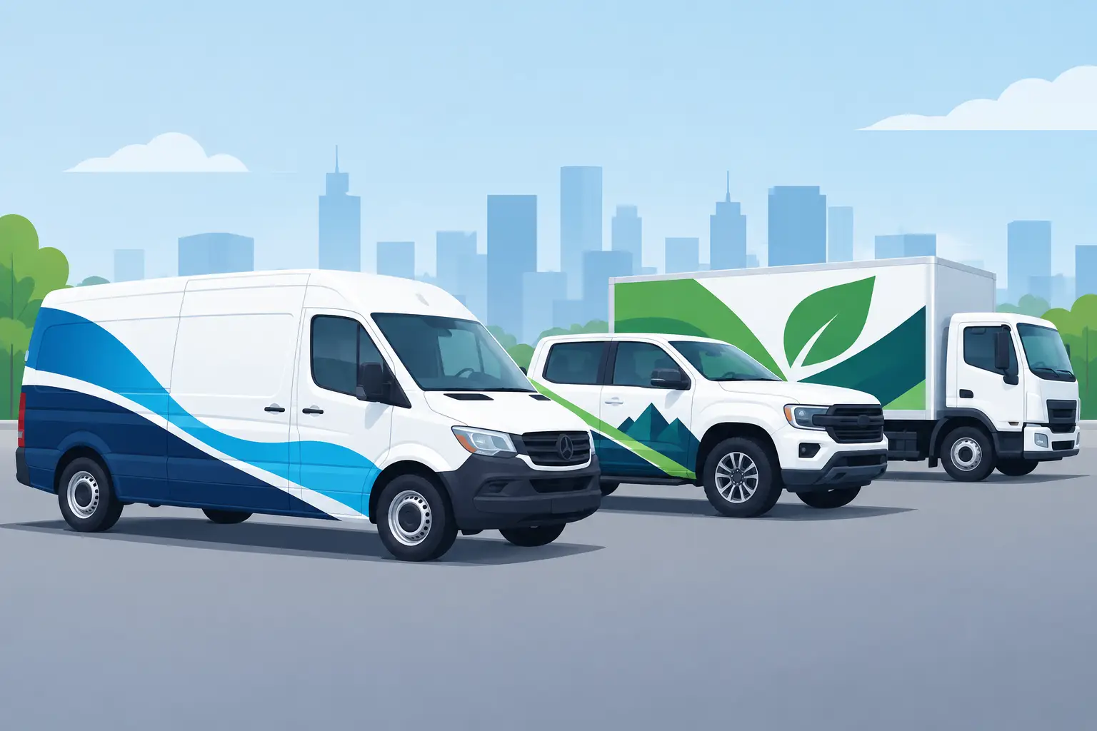
A fleet truck has only a few seconds to tell people who you are, what you do, and whether they can trust you. That is why the strongest custom fleet graphics trends are not about cramming more artwork onto a vehicle. They are about making your name, service, and contact information impossible to miss at a stoplight, in a parking lot, or on a jobsite.
For contractors, delivery operators, mobile service businesses, and growing local brands, fleet graphics have become a working part of the sales operation. A clean set of door decals or a well-planned partial wrap can turn every route into local advertising. The right approach depends on your vehicles, service area, budget, and how often the fleet changes, but the direction is clear: graphics need to work hard, look professional, and stay readable.
Clean, High-Contrast Branding Leads the Way
Busy designs are losing ground to graphics with a clear hierarchy. Your company name gets the biggest visual priority. The primary service comes next, followed by a phone number, website, or short call to action. That is the order a driver or pedestrian can process quickly.
High contrast is doing much of the heavy lifting. Dark lettering on white vans, white lettering on dark pickups, and a single bright brand color against a neutral vehicle finish all deliver strong visibility. This is especially useful for trades that operate at dawn, dusk, or on crowded roads where details disappear fast.
This does not mean every fleet needs a plain black-and-white look. A bold color stripe, badge, mascot, or icon can give a vehicle personality. The difference is restraint. Use the visual element to support the message, not compete with it.
Bigger type beats clever type
Custom fonts can establish a brand, but a fleet is not the place for lettering that requires a second look. Highly decorative scripts, thin strokes, and tightly spaced letters may look sharp on a business card yet become hard to read from 30 feet away.
Choose a font with solid letter shapes and enough spacing to remain legible on moving vehicles. If your established logo uses a stylized typeface, pair it with simple supporting lettering for services and contact information. That small decision can make a major difference in how much business your vehicle graphics generate.
Modular Graphics Fit Real-World Fleets
One of the most practical custom fleet graphics trends is the shift toward modular layouts. Instead of treating every vehicle as a one-off project, businesses create a consistent graphics system that can be adapted across pickups, cargo vans, box trucks, trailers, and specialty equipment.
A modular system usually includes a standard logo position, approved brand colors, service descriptors, and a repeatable contact-information layout. The graphics stay consistent even when vehicle body shapes change. A short-bed truck and a high-roof van do not need identical artwork to look like they belong to the same company.
This approach matters when you add vehicles over time. You do not have to restart the design process every time a new truck arrives. You can keep the brand recognizable while adjusting size and placement for each panel. It also helps when a vehicle is sold, damaged, or replaced, because individual lettering and graphics are easier to reproduce than an entirely custom full wrap.
For many service fleets, this is the sweet spot between bare vehicle lettering and a full wrap. Door lettering, a rear-window graphic, a bold side-panel logo, and matching unit numbers can create a professional look without committing the entire vehicle to printed vinyl.
Partial Wraps Are Being Used More Strategically
Full vehicle wraps still make a strong statement, particularly for brands with a large service territory or high-volume local traffic. They provide the largest visual canvas and can create an unmistakable presence. But more fleet operators are choosing partial wraps and pairing them with cut vinyl lettering for a better balance of impact and cost control.
A partial wrap can cover the rear quarter, lower body, hood, or a broad band along the side of the vehicle. It gives the design color and movement while leaving painted areas visible. Add clean vinyl lettering over the top, and the main information remains crisp and easy to update.
The trade-off is design discipline. A partial wrap must look intentional. Random shapes or artwork that stops in awkward places can make the vehicle appear unfinished. Work with the body lines, door seams, wheel wells, and existing paint color instead of fighting them.
For fleets that lease vehicles or turn over equipment frequently, cut lettering and smaller graphic packages may be the smarter choice. Removal is generally simpler, replacement costs are easier to manage, and the design can transfer cleanly to the next vehicle model.
Reflective Vinyl Is Moving Beyond Emergency Vehicles
Reflective lettering and accent graphics are gaining ground for businesses that work after dark, park on roadsides, or want extra visibility during early morning routes. Tow companies, utility contractors, landscapers, delivery services, and mobile repair crews all have practical reasons to consider it.
Used well, reflective vinyl gives a fleet a polished daytime appearance and a brighter nighttime presence when headlights hit the graphics. It can be used for company names, unit identification, safety striping, or rear-door messaging. It is not just a visual upgrade. On work vehicles, it can help other drivers see the vehicle and its edges more clearly.
The right level of reflectivity depends on the job. Some fleets need high-visibility markings because of their work environment or customer requirements. Others may only want reflective accents around a logo or on rear doors. Check any applicable local, state, or industry-specific requirements before treating decorative reflective graphics as compliance markings.
Vehicle-Specific Information Is Becoming Part of the Brand Package
A professional fleet design now often includes the operational details a business cannot skip. USDOT numbers, GVW decals, unit numbers, inspection information, fuel labels, and other required identifiers no longer need to look like an afterthought.
When the same colors, fonts, and spacing carry through from the logo to compliance lettering, the entire vehicle looks more organized. That matters to customers. A clearly marked truck suggests that the crew, equipment, and business behind it are equally prepared.
Placement still matters. Required lettering must remain visible and readable, so do not bury it inside a complex design. Keep it away from door handles, deep body contours, hinges, and areas likely to receive heavy wear. Measure the usable panel area rather than guessing from a vehicle photo, especially on newer trucks with oversized trim, molded panels, or wide door gaps.
Local Identity Is Beating Stock Imagery
Generic house icons, wrenches, lawn mowers, and lightning bolts still have a place, but fleet graphics are becoming more specific to the company behind the vehicle. Businesses are using custom badges, service-area callouts, established-since dates, team slogans, and regional identity to look less interchangeable.
A roofing company may use a strong roofline graphic that matches its logo. A marine service company might use clean registration-style lettering and water-inspired striping without making the boat or truck look cartoonish. A motorsports shop can bring race-number energy into a service van while keeping the phone number readable.
The goal is not to decorate every available inch. It is to give people a memorable visual cue they can connect to your business later. One distinctive element, repeated across the fleet, is often more effective than several unrelated graphics.
Durable Materials and Smart Placement Matter More Than Ever
Fleet graphics live through sun, rain, road grime, pressure washing, fuel stops, and constant door use. A great layout printed on the wrong material or installed on a poorly prepared surface will not perform the way it should.
Choose exterior-grade vinyl designed for vehicle use, and match the product to the job. Flat door panels are ideal for cut lettering and decals. Curved panels, rivets, deep channels, and compound curves may call for materials and installation methods better suited to complex surfaces. Magnetic signs can be useful for temporary branding or personal vehicles used for work, but they need clean, dry surfaces and regular removal for cleaning.
Before ordering, think about where the vehicle takes the most abuse. Lower rocker panels see more road debris. Rear doors collect grime. Frequently used sliding doors and handles need enough clearance that lettering will not lift at edges. Planning around real use is more valuable than forcing a design onto every surface.
Build a Fleet Look That Can Grow
The best fleet graphics do not chase a trend for its own sake. They make the company easier to recognize, easier to contact, and easier to trust. Start with the information customers need most, choose colors and lettering that hold up at distance, then add visual personality where it earns attention.
If you are updating one truck or standardizing twenty, create the core layout before ordering individual pieces. With online tools from eDecals.com, you can build custom lettering and graphics around your actual vehicle, brand colors, and required information. A fleet that looks organized before it arrives on the job sends the right message before the crew even opens the door.