
A truck door gives you only a few square feet to make an impression. If your company name is too small, it disappears in traffic. If the lettering is oversized, the layout can look crowded before you even add a phone number, website, or USDOT number. So, what size truck door lettering should you choose? The right answer starts with how far away people need to read it and how much information belongs on the door.
For most work trucks, a business name in 3- to 5-inch-tall letters is a strong starting point. It is large enough to read from a reasonable distance while leaving room for supporting details. But a one-size-fits-all answer can create a poor-looking door. A compact pickup, full-size crew cab, cargo van, box truck, and semi tractor all offer different usable space.
What Size Truck Door Lettering Is Easy to Read?
Letter height is the biggest factor in readability. As a practical rule, each inch of letter height provides roughly 10 feet of readable distance under good daylight conditions. That means 2-inch lettering works for close-up information, while 4-inch lettering is easier to recognize from across a parking lot or roadside.
For a typical contractor truck or service vehicle, use 3- to 5-inch letters for the business name. If your company name is short, 5 or 6 inches can create bold, high-impact branding without overpowering the door. Longer names usually need a slightly smaller height or a stacked layout to stay inside the flat area of the door.
Phone numbers, websites, service descriptions, and license information can usually run smaller. A range of 1.5 to 3 inches works well when that copy is meant to be read while someone is standing near the truck. Keep in mind that thin or highly decorative fonts may need more height than a simple bold font to remain legible.
The best-looking lettering is not always the largest lettering. It is the lettering a customer can quickly understand while your truck is parked, pulling into a job site, or waiting at a light.
Start With the Usable Door Area
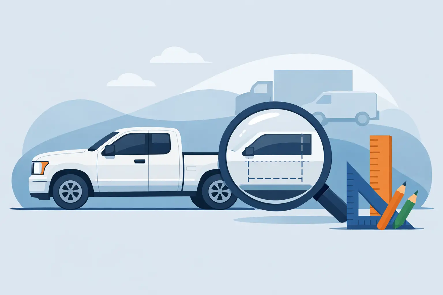
Do not measure the entire truck door and assume every inch is available. Door handles, body lines, hinges, molding, fuel doors, keyholes, factory decals, and curved panels all affect the layout. Measure the widest and tallest flat section where lettering can sit without wrapping around an edge or being interrupted by hardware.
On many full-size pickups, the main usable panel is approximately 30 to 40 inches wide and 15 to 20 inches tall. That often supports a company name in 4-inch letters, with a phone number or service line below it in 2-inch letters. Compact trucks may call for 2.5- to 4-inch company lettering, especially when the name has many characters.
Cargo vans and box trucks give you more room, but more space does not mean you need to fill it. A large blank area around your name can make the lettering look more intentional and more premium. On a box truck, 6- to 10-inch letters may be appropriate for a primary company name, particularly if the vehicle serves as a moving billboard.
Before ordering, use a tape measure and painter’s tape. Mark out the approximate width and height of your intended lettering directly on the truck. Stand 20, 50, and 100 feet away. This quick test reveals whether your design is balanced or whether it needs more visual punch.
Match Letter Size to the Job the Truck Does
A plumbing truck, a hotshot rig, and a fleet delivery vehicle should not necessarily use the same lettering plan. The job determines what people need to see first.
For service businesses, make the business name and primary service easy to identify. A homeowner who sees your vehicle at a neighbor’s house should understand who you are and what you do in seconds. A business name at 4 inches, paired with a concise service description at 2 to 3 inches, is often more effective than cramming every service you offer onto the door.
For commercial fleets, consistency matters as much as size. Choose a standard layout that works across pickups, vans, and larger units, then adjust proportionally where necessary. A uniform logo position, font, color, and hierarchy make a fleet recognizable even when vehicle sizes change.
For owner-operators and regulated commercial vehicles, compliance copy should be clear without taking over the design. USDOT numbers, MC numbers, legal business names, and GVW markings may need specific visibility or placement based on your operating authority and state requirements. Federal rules focus on contrasting lettering that can be read from 50 feet away while the vehicle is stationary in daylight. Check the current requirements that apply to your operation before finalizing a size.
For personal pickups, the choice is more about style. A 2- to 4-inch door decal can add a clean custom touch, while larger lettering suits off-road builds, ranch trucks, race support vehicles, and bold sponsor-style graphics.
Font Choice Changes the Size You Need
Two fonts set at the same letter height can look dramatically different. Wide block lettering has more visual weight than a narrow script. A thick, simple font also reads faster at a distance than an ornate font with thin strokes, shadows, or intricate edges.
If the lettering carries essential business information, favor clean sans serif, block, or bold serif fonts. These are built for quick recognition. Scripts, Old English styles, distressed effects, and outlined fonts can look great for a custom build or specialty brand, but they work best for short names and large display lettering.
Color contrast matters just as much. Black lettering on a white truck, white lettering on a dark truck, and bright colors against a neutral panel are reliable choices. Dark blue on black or gray on silver may match a brand palette, but it can disappear at a distance. If you want a subtle color combination, consider a contrasting outline to separate the letters from the paint.
Build a Clear Information Hierarchy
Your door does not need to say everything. It needs to say the most valuable thing first.
A strong truck door layout usually puts the company name or logo at the top of the hierarchy, followed by a short service description and a contact method. For example, a landscaping company might lead with its name in 4-inch letters, use a 2-inch line for “Lawn Care and Landscaping,” and place the phone number or website beneath it.
Keep the smallest copy for secondary details. If a phone number is so small that it cannot be read until someone is next to the vehicle, it may still be useful when the truck is parked at a job site. It should not, however, be the only way someone can identify your business.
Avoid squeezing a long list of services, multiple phone numbers, social handles, and regulatory copy into one tight block. The result may technically contain all the information, but it will not be easy to read. Use the doors for the essentials and reserve larger side panels, tailgates, rear doors, or trailer space for additional messaging.
A Practical Truck Door Lettering Size Guide
Use these ranges as a starting point, then adjust to your door panel, font, and message length:
- 1 to 2 inches: USDOT numbers, unit numbers, websites, short compliance copy, and close-range details.
- 2 to 3 inches: Phone numbers, service descriptions, smaller business names, and secondary branding.
- 3 to 5 inches: Primary business names on most pickup trucks, vans, and service vehicles.
- 5 to 8 inches: Short company names, bold fleet identifiers, large van graphics, and highly visible truck branding.
- 8 inches and larger: Box truck panels, trailers, and designs intended for long-distance recognition.
These ranges assume a straightforward, readable font. If you choose a tall narrow font, a complex script, or letters with multiple outlines and effects, move up in size to protect legibility.
Design for the Real Conditions Your Truck Sees
Truck lettering has to perform outside, not just look good on a computer screen. Sun glare, dirt, rain, speed, shadows, and angled viewing all make small or low-contrast copy harder to read. A design that looks balanced on a bright white design canvas may need larger letters or stronger contrast on an actual vehicle.
Durable outdoor vinyl and a clean installation surface help the finished lettering stay sharp, but layout is still the foundation. Leave clearance around handles and body seams, make sure individual letters are not too thin for the chosen size, and verify that the lettering will sit on a smooth painted surface whenever possible.
At eDecals.com, you can build custom truck lettering around your actual measurements, select the font and color that fit your brand, and see the layout before it goes into production. Start with the door space you have, then give the most important words enough size to do their job.
A truck is already on the road, at job sites, and in front of potential customers. Give its door lettering the room to be seen, read, and remembered.